
Branding a conundrum
Role: creative direction, writing
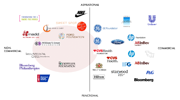
When the world’s biggest brewery decides to invest reducing harm from alcohol consumption, there is an inherent paradox—after all, isn’t the obvious answer to just sell less stuff? How can a company balance its responsibility to shareholders with being a good citizen of the world?
Lofty question. For ABInBev, this meant establishing an independent foundation to oversee evidence based interventions and approaches. For us, it just meant we had to develop the brand hallmarks to help set the tone around the core pillars of transparency, local leadership, and academic integrity along with digital tools to support.

The form of the mark is made up of overlapping bars. They are arranged in a circle to represent the equality of the various stakeholder interests. The translucence symbolizes the foundation’s commitment to transparency. And the color palette starts with AB InBev’s corporate “harvest colors” palette and expands it with bright yellows and pinks to represent new energy and optimism.
Every graphic element is designed to deliver on the brand pillars.


A key touchpoint for an organization like this is the website. It needed to clearly articulate the mission and aims of the foundation to a range of stakeholders, from academic partners to pilot city governmental agencies to the corporate sponsor.
In addition to the organization site, we created a mini-site designed to help partners establish programs and interventions and to document their progress.
A few artifacts from the brand definition process.

I have impossibly bad handwriting and I cannot spell even the most basic words. (Don’t judge.)
![]()
Attribute mapping and mood boards…